Tag: design

The Look Behind the Sound

Past Spotify mobile design on different phones

Over the past 20 years, Spotify’s look and feel has evolved with the way people use our platform, while ensuring we preserve an intuitive, personal, and familiar experience for anyone who presses play. Every change, big or small, has been shaped by how users, artists, podcasters, and authors discover, share, and connect on Spotify.

For the Record caught up with Spotify’s Nicole Burrow, VP of Product Design, and Lauren Solomon, Senior Director of Global Brand, to explore the elements that have defined Spotify’s brand and visual identity on and off platform, and the things that make it feel unmistakably Spotify today.

Where does the name “Spotify” and its iconic green come from? 

Lauren: It’s funny, because something as iconic and identifiable as the name “Spotify” didn’t actually start from this big, strategic decision. According to stories from those who were in the room where it happened, it was misheard in a brainstorm. Our co-founders Daniel [Ek] and Martin [Lorentzon] were throwing around ideas, and one of them landed as “Spotify”—but it was essentially an accident.

Nicole: What I love about that is the meaning came later—and it was our users who conveyed that meaning. The lore has become that it’s a blend of “spot” and “identify,” which, when you think about it, is exactly what our platform helps users do. You hear something, you recognize it, you make it yours. But that wasn’t engineered from the start. It grew into its meaning, the same way our platform grows to respond to our users.

Lauren: The green was the opposite. That was a very intentional choice. At the time, everything in tech felt so safe. A lot of blues, a lot of neutrals, a lot of… meh. Choosing this really bold, bright green was about standing apart immediately. It had energy. It felt alive. It matched the spirit of disruption and innovation that came with the founding of Spotify.

Nicole: The exact shade of green has evolved, but the idea hasn’t. It still needs to feel vibrant, a little unexpected, and very much its own thing. That’s kind of the thread across both the name and the color—we weren’t about following an existing formula. In the same way we weren’t following a formula in the creation of the company. We were about creating something that felt different from day one.

Spotify logos through the years

In your opinion, what makes Spotify’s design instantly recognizable?

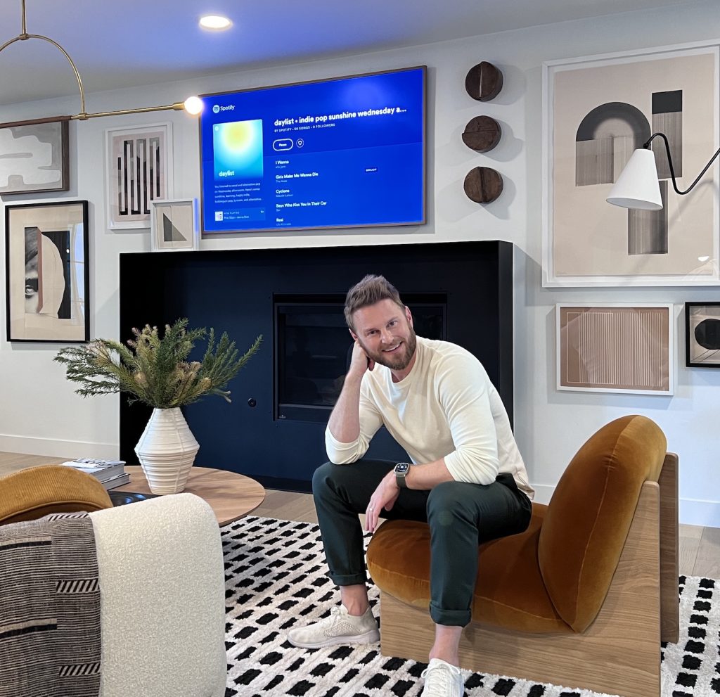
Nicole: Alongside the Spotify green, we were also an early dark mode app, long before dark mode became as popular and pervasive as it is now.

Spotify 2013 mobile view

Lauren: There’s our unique typeface, Spotify Mix, designed to be truly distinct to us. It’s dynamic, so it can be used across a range of expressions, and be responsive to where it sits.

There are also so many things you don’t instantly see, but you feel. We understand that what you listen to is deeply personal, and that many use Spotify as a home for their creativity. Our brand reflects that. We have brand elements that remain consistent but also allow room and flexibility to shift with culture, content, creators, and our community.

Nicole: And our personality comes through in how our app “talks” to you—playful and culture-obsessed. We “talk” the way fans talk, because we’re fans ourselves. That’s one of the ways we underline how well Spotify knows you.

Then, of course, there’s Spotify Wrapped—which set a standard in the industry. It inspired many copycats, but Wrapped helped define the format and created a truly shared moment for fans around the world.

Wrapped does feel unique to Spotify. When you think back to our platform in its earliest days, what else stands out to you?

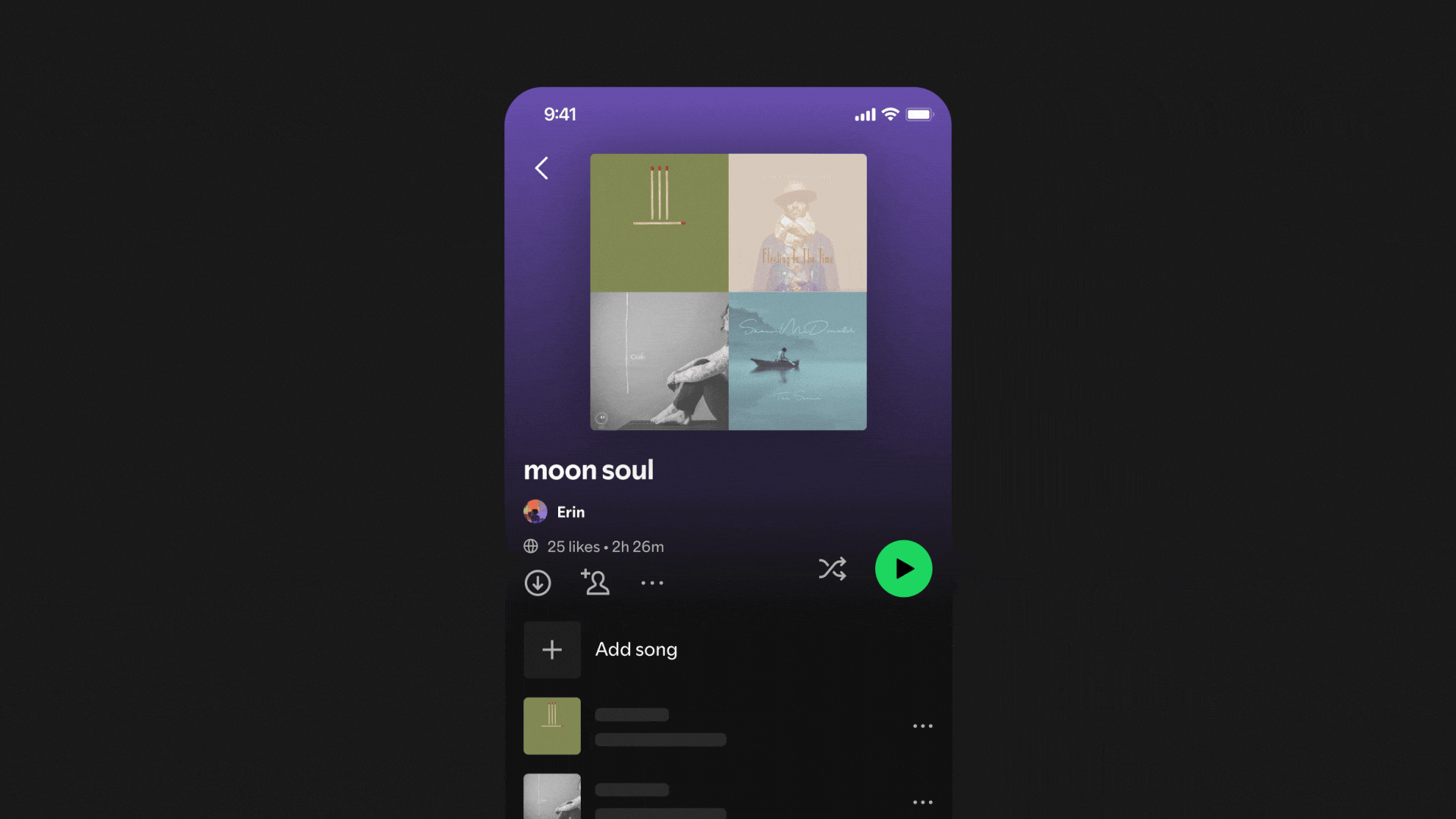
Nicole: We were the first app to prioritize playlists. Early versions were built around playlists as the main user experience. Today, playlists continue to be one of our strengths and one of the key ways fans can express who they are and what they love. Playlists are where much of our innovation happens. 

When you look at our recent innovations like Prompted Playlist and mixed playlists, they build on what’s been true since our earliest days—playlists are at the heart of the Spotify experience and one of the main ways listeners express who they are. What’s changed is that playlists are no longer static. There has been a real shift from playlists you make or follow to playlists that actively respond to you. It’s a more dynamic, adaptive experience, and it’s a big part of how we continue to push personalized listening forward.

How has Spotify’s design adapted as listening behavior has changed over time?

Nicole: A good example is users listening more often in group settings with friends—turning listening into something shared. We’ve made sure listening together is just as easy through features like Request to Jam and Wrapped Party.

And we’re already revolutionizing how people can listen to audiobooks. We’ve introduced industry-leading features like Recaps and Page Match, which were born from the idea of giving listeners the flexibility to enjoy stories in the way that works for them in any given moment. That idea of personalized listening is really at the heart of everything we do.

Lauren: The Spotify brand people know today was built from celebrating the behavior of our users. We pioneered helping people understand their listening through data storytelling, making it a true reflection of the community on our platform.

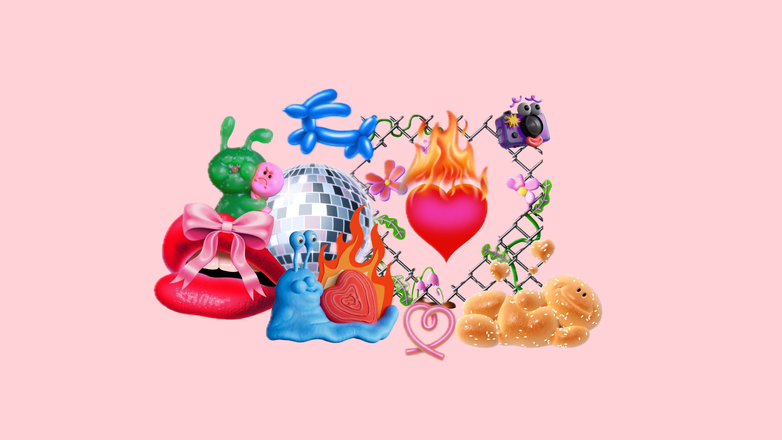
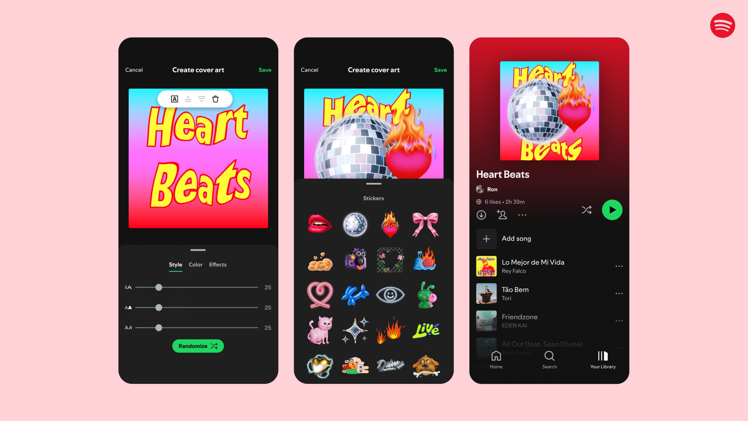
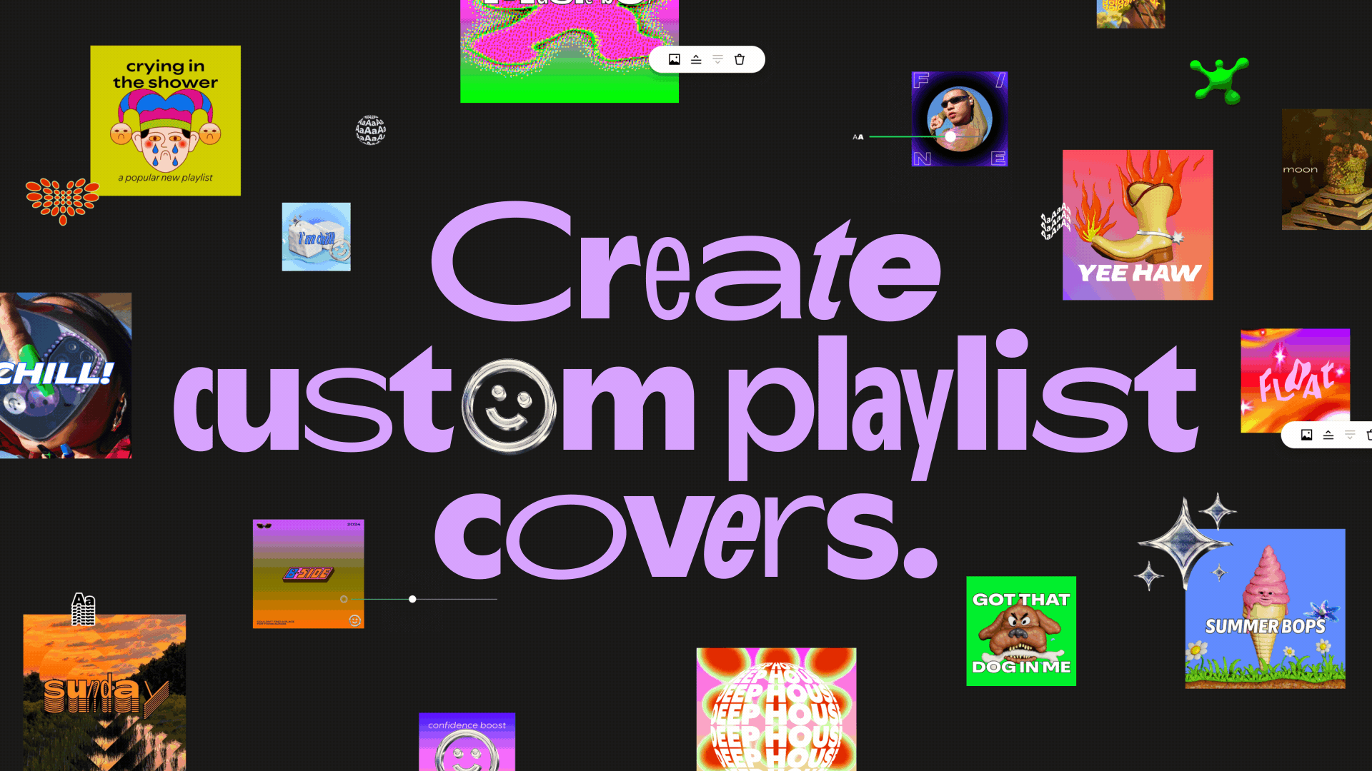
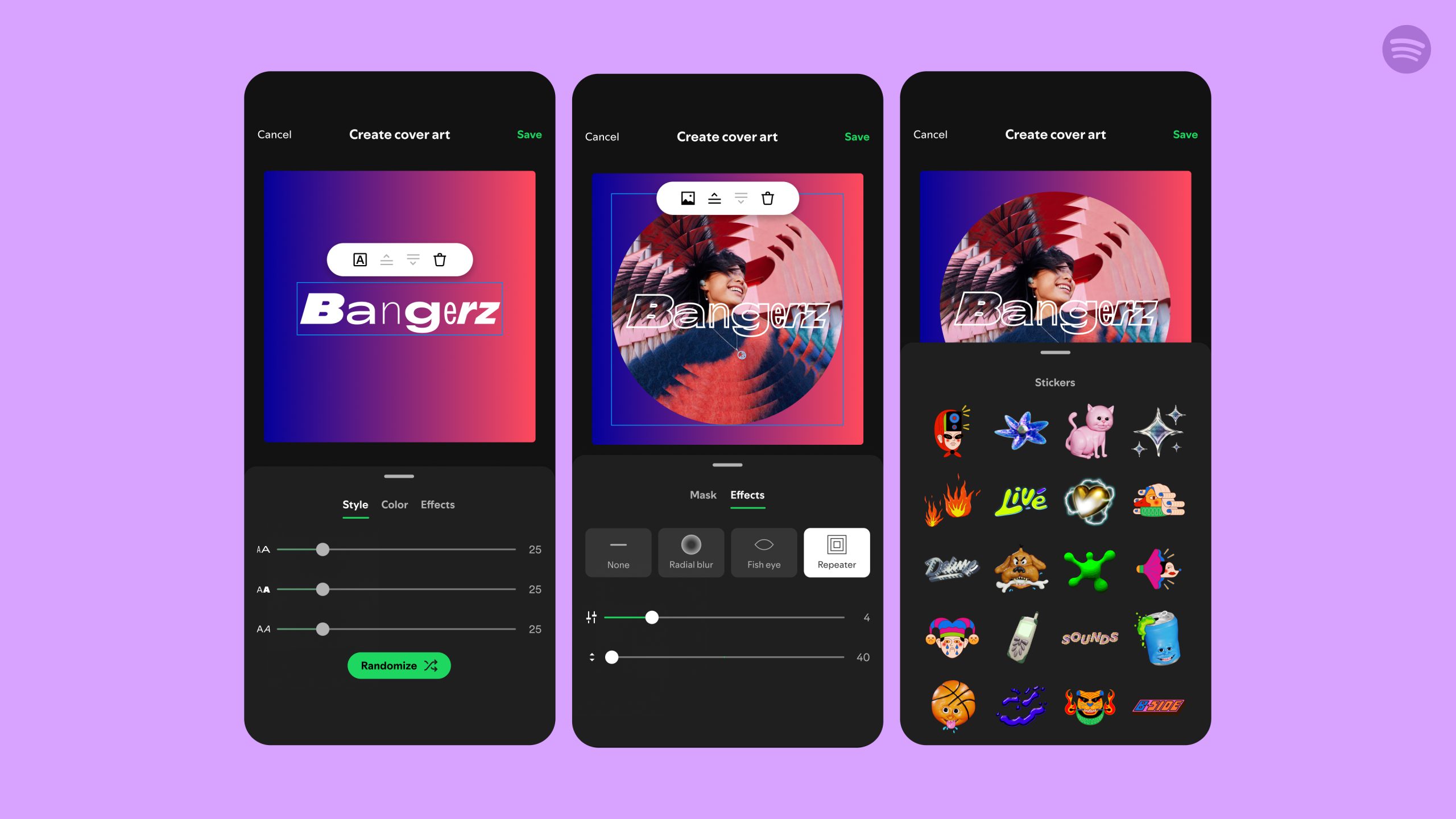
We know our users are really creative and feel that their listening is a deep reflection of who they are, so we’ve created experiences and tools that give them new ways to express themselves, like the playlist cover art tool and mixing tools.

As podcasts, audiobooks, and videos have joined the platform, how has the design evolved to support them?

Nicole: We believe in the “one experience” approach. One that feels coherent while adapting to context. Every major shift starts with how fans want to listen. We give users more control, more context, and more meaningful engagement with what they hear. Over the years, we’ve continuously evolved our UX and interface to respond to what a user is listening to, shaping the experience to feel relevant in each moment. This has meant designing with flexibility at the core. 

Spotify desktop view over the years

How have outside design trends influenced Spotify’s look?

Lauren: We’re fans ourselves, so that’s where our heads naturally go: music, creators, content, culture. That’s the stuff that moves people, and it’s what we draw from. This is what makes our work feel expressive, honest, and timely. It doesn’t look like everyone else because it didn’t come from the same place as everyone else. 

Wrapped is a great example of this. Every year the design is created specifically for that moment. It’s something people look forward to.

Spotify Wrapped designs over the years

What’s one small Spotify design detail that might go unnoticed but is intentional?

Nicole: Easter eggs have a long-standing tradition at Spotify. When Stranger Things Season 4, Volume 1 was released, we transformed the Now Playing view into an upside-down experience, which sparked a shared, viral moment among fans. We’ve also created Easter eggs to celebrate Spotify’s most-streamed artists of the year: Taylor Swift in 2024, and Bad Bunny in 2025. Keep an eye out for new Easter eggs—more are on the way!

Another small detail that not everyone has noticed yet is the “Eat This Playlist” game featured in some playlists. This was an internal hack project that has garnered a lot of love from users over the years. If you haven’t seen it before, just open a playlist, tap the three dots menu, then select “Eat This Playlist” at the bottom to play!

Lauren: At key moments, we adapt our logo bug and let it become an expression of culture. A great example of this is the past two years on Wrapped. Before launch, we released a set of logos adapted to reference some of the top artists, tracks, and albums of the year, teasing what’s to come.


View this post on Instagram


A post shared by Spotify (@spotify)

Last question: How do you balance staying fresh and relevant while remaining true to our brand’s core look and feel?

Nicole: We lean away from chasing trends while making sure we’re always culturally fluent—meaning our voice evolves naturally as culture moves. Our playful, bold, opinionated heart never changes, but our language reflects the way our listeners speak and express themselves. That has changed plenty over the last 20 years, and will continue to evolve with them over the next 20.

To explore more from the anniversary celebration, visit our Spotify 20 hub.

Introducing a Smarter, Smoother Experience for Tablets

Adaptive Tablet Layout screens

At Spotify, we want your experience to feel intuitive and personal across every moment of the day. Whether you’re streaming your favorite playlist while you work or browsing new recommendations on the go, Spotify should feel familiar and easy to use. With tablets—which are often used on the sofa or at a kitchen counter and offer more screen space to browse—we saw an opportunity to give the Spotify experience a little refresh.

Today we’re introducing a new app experience tailored for your tablet, designed to make listening, watching, and discovery feel more natural on larger screens.

A smarter, more responsive design

The refreshed tablet layout, available on iOS and Android devices, is designed to create a more seamless experience across screens where you use Spotify. Rather than simply scaling up mobile components, we designed the tablet experience to take advantage of the extra space, so you can browse and discover new favorites right alongside what you’re already playing. In addition, improvements we make to mobile can reach tablet users faster.

“From TV to desktop to the car, we’ve been designing Spotify to feel native to each screenand now we’re bringing that same experience to tablets,” said Nicole Burrow, Head of Design, Consumer Experience, Spotify. “Tablets give you more room to explore, so we designed it to let you browse and discover new favorites alongside what’s already playing. The goal was simple: Wherever you open Spotify, it should feel unmistakably like Spotify.”

What’s new

    • Adaptive orientation: The interface now reconfigures—not just resizes—as you switch between portrait and landscape, so it feels balanced and intentional in both views.
    • A collapsible sidebar: The new sidebar lets you browse and discover alongside your playback, or expands for deeper focus. It also includes interactive, scrollable content so you can explore without leaving what’s playing.
    • An enhanced video experience: The “Switch to Video” toggle is now front and center, making it simpler to move into a more immersive viewing experience.
    • Parallel browsing: Keep music or video playing on one side of the screen while you explore your library or recommendations on the other.
    • A familiar feel: The core navigation stays the same, so the experience still feels like a natural extension of the mobile app. The bottom navigation bar keeps your main pages within easy reach, while the collapsible side drawer gives you quick access to your profile and settings.

With this update, your tablet becomes an even better place to discover music, podcasts, audiobooks, and video. It’s another step toward a more unified Spotify experience, one that can keep evolving across the devices you use today and the ones you’ll use tomorrow.

Spice Up Your Valentine’s Day Playlist Covers With Spotify’s New Sticker Collection

With more than 1.6 million Valentine’s Day playlists created globally on Spotify, we know music fans feel the love this time of year. Now, you can make those playlists even more special with the new collection of love-themed stickers we added to our “Create Cover Art” feature.

Available in 65 markets around the world, this feature lets you design and customize your own playlist covers with unique images, colors, text effects, and graphic elements. The 12 new stickers include adorable icons like a flaming heart, a love snail, and more, so you can make your Valentine’s Day playlists look as good as they sound.

Make your love-themed playlists pop

  • Whether you’re on iOS or Android, head to the Spotify mobile app (make sure it’s up-to-date) and select a playlist that you personally created (or create a new one) to get started. Then tap the three-dot menu and choose “Create cover art.”
  • From there, you can access our exclusive Valentine’s Day stickers, along with other creative elements like backgrounds and text.
  • Once complete, save and share your playlist with someone special.

And while you’re busy curating the perfect Valentine’s Day soundtrack, check out some of the top tracks and most-streamed love songs on Spotify*:

Top 5 tracks added to Valentine’s Day playlists

  1. Just the Way You Are” – Bruno Mars
  2. All of Me” – John Legend
  3. Can’t Help Falling in Love” – Elvis Presley
  4. My Girl” – The Temptations
  5. Lover” – Taylor Swift

Top 5 most-streamed love songs

  1. Perfect” – Ed Sheeran
  2. Say You Won’t Let Go” – James Arthur
  3. I Wanna Be Yours” – Arctic Monkeys
  4. Yellow” – Coldplay 
  5. Photograph” – Ed Sheeran

Need more music inspiration for the heart-shaped holiday? Head to Spotify’s Valentine’s Day hub to discover playlists for every mood.

*All data is global and was pulled on January 16, 2025.

Take Your Spotify Playlists to the Next Level With Custom Cover Art

At Spotify, we know our users like to flex their creativity. We’ve seen this come to life across the more than 8 billion playlists listeners have created to soundtrack their musical moods, milestones, and every moment in between. Now we’re giving music fans the power to design and customize their own playlist cover art so their playlists can always look as good as they sound.

Rolling out in beta on the Spotify mobile app today, the new feature offers both Free and Premium users the ability to create their own cover art with unique images, colors and text effects, graphic elements, and more, allowing them to make their music playlists more unique and personalized than ever before.

Creating cover art on Spotify

All you need is a mobile device to access and use this feature. Whether you’re on iOS or Android, head to the Spotify mobile app (make sure it’s up to date) and select a playlist that you personally created or create a new one.

  • Tap the three-dot menu on the playlist page and then select “Create cover art” within the menu options.
  • From there, you can upload an original photo of your own and add or update a variety of elements, including:
  • Once complete, your playlist will be updated with your new cover art, and you can share your creation directly with friends or on social media platforms.

Pro tip: You can only save one custom cover art per playlist at a time, and each new cover you create will override the previous one for that specific playlist. If you’d like to create multiple covers for a playlist, make a copy of the playlist first. The easiest way to do that is to open the playlist you wish to copy, tap the three-dot menu, select “Add to other playlist,” and then tap “New playlist” to create your copy.

With the feature currently available in beta to users in English in 65 markets, we’re excited for fans to personalize their music playlists like never before. We’ll keep innovating and expanding the tool, so stay tuned for what’s to come.

Get inspired by the experts

As part of the launch, we’ve partnered with music artists, visual creators, and artists behind some of the world’s most iconic album art to empower listeners to unlock a new level of creativity and individuality. Each used the new feature to create unique cover art for one of their playlists on Spotify.

Music artists include Clairo, Jamie xx, and Arlo Parks. On the visual creator front, we’ve tapped Pablo Rochat, Jesse Nyberg, Vita Kari, and Elliot Ulm. Finally, our album artwork experts include creative director Imogene Strauss; Adrian Hernandez, the creator of Ugly Primo and designer of Un Verano Sin Ti by Bad Bunny; and Cey Adams, who has designed albums and logos for The Notorious B.I.G., Beastie Boys, and JAY-Z.

Interior Design Expert Bobby Berk Shares Top Tips for Making Your Living Room an Audio Oasis

a graphic illustration showing two people listening to spotify on television.

As the weather outside becomes more frightful, it’s time to make your living room delightful. So cozy up your home’s vibes by allowing your favorite music or podcasts to filter through the living room. From countless brands of smart speakers to easier-than-ever TV listening, it’s seamless to connect and enjoy audio with congregating family and friends. 

Bobby Berk knows a thing or two about cultivating the perfect ambience for a living room. The interior design expert and author is well-known for his stylish and youthful designs and has been one of the “Fab Five” on Netflix’s popular makeover show Queer Eye. This makes Bobby the perfect person for Spotify to partner with to show fans how audio and home design go hand in hand. And while your home decor aesthetic is as unique as your music taste, a few extra tips can go a long way in creating the perfect space for yourself.

For the Record sat down with Bobby to understand more about designing a welcoming living room space, as well as what you’ll find on his perfect music playlist for home entertaining.

What’s the historical function and significance of the living room?

From its beginnings in the late 19th century, the living room was a more formal space in the home used primarily for entertaining guests. It consisted mainly of more-tailored seating and a layout built around conversation. It wasn’t until the mid-20th century that the living room became a more casual space for spending time with family, relaxing, listening to music, or watching TV. The design itself was also adapted to be more about comfort and a sense of coziness.

What are your top three tips for designing a welcoming, comfortable, and functional living room?

First, add seating that looks—and most importantly feels—good. Next, create a layout that encourages connection but is also open. Place your furniture in a natural, conversational grouping. You also want the layout to feel welcoming, so be sure to leave space to enter the room and move through it easily. Finally, bring in soft and cozy materials. Adding pillows, throws, and a soft rug underfoot will create a comfortable living room that you really want to spend time in.

What do you like to listen to when designing and working? How about for hosting?

If I really need to get focused and get things done, I prefer a chill instrumental mix like Focus Flow or Workday Lounge. When designing, I’ll listen to something more upbeat, a pop mix or one of my favorite artists, Rozzi.

My ideal hosting playlist would take you on a journey starting with smooth jazz and a cocktail lounge vibe. Then I would move into some pop classics and top 40 hits, get things a bit more energized, and then finish things off with more relaxed, ambient tunes.

How do acoustics, sound, and entertainment fit into your living room concepts?

I’m always thinking about how someone will use a space when designing, and that definitely includes entertainment and sound. You don’t want a living room to be an echo chamber, so I bring in materials like a rug, upholstery, and curtains to soften things and improve acoustics.

What’s your go-to smart speaker?

I have a number of Sonos speakers throughout my home, and I love that I can easily connect Spotify to just one speaker—like, if I want to sing in the shower, the portable speaker if I’m outdoors, or the whole house if I’m entertaining.

Spotify’s daylist provides you with a custom playlist multiple times per day depending on what you listen to around the clock. What are you loving about the feature so far?

My mood definitely changes throughout the day, so it’s nice to have a playlist that changes along with it! In the morning, I have a mix that gets me motivated and focused for the day, a high-energy workout mix for the afternoon, and something a bit more chill for unwinding at the end of the day.

Whether it’s a Feel Good Morning Niche Mix for those who love a fresh, light, and airy aesthetic or a warm pumpkin spice evening daylist for those channeling a cozy winter atmosphere on the couch, Spotify’s personalized playlists can help you feel right at home.

Global Head of Brand Design Rasmus Wangelin Explains the Creative Behind Spotify 2021 Wrapped

Spotify Wrapped: You eagerly anticipate its arrival. You swoon over the in-app experience. You share your results on your socials. You snicker when you see the ads during your commute. But do you know what goes into Wrapped’s unique visual identity each year?

Many months ahead of Wrapped’s December launch, Spotify’s Brand & Creative team comes together to refresh Wrapped as a true campaign and experience that reflects on the year with its own unique look and feel. To get the scoop, For the Record spoke with Spotify’s Global Head of Brand Design Rasmus Wangelin. He shared the considerations he and his team put into Wrapped year after year—and what’s special about the creative for 2021.  

What is your role within the Spotify Brand & Creative team? How does your work throughout the year transition into Wrapped?

In collaboration with my team, I oversee Spotify’s design work for brand and marketing globally. I run a team of between 15 and 20 designers, art directors, and design directors working alongside me across different initiatives. They can range from brand marketing, music and podcast marketing, art direction and branding, design thought leadership, and problem solving any design-related issues for the company as a whole. We really work and collaborate with almost all parts of Spotify. We’re also always proactively working in the background on the brand itself—the rules around it, guidelines, how it comes to life.

Wrapped is probably the biggest project we do every year. And it’s not like other projects end—but because we know Wrapped is coming, we have to orchestrate and organize our team to be able to support it properly, alongside everything else that we still have going on. 

And funny enough, design explorations for Wrapped actually start in June every year. We have to start that early in order to land the design direction so that we can then build an extensive tool kit that will be used by all of our partners and agencies globally.

What are some of the considerations that go into the Wrapped visual identity each year? 

I think there are a few different answers here. I think the most important one is that the way we tell the story of music and audio culture every year shifts, right? So we actually want to look at the year that has been and align our way of talking and our ideas with the year. As you can see, every year has a slightly different theme. And it’s important for us on the design front to make sure that whatever design we create matches the sentiment of the way we’re talking about the year conceptually. 

And then outside of that, we actually aspire to create a completely new and fresh articulation of our brand every year. That is Spotify. We’re always inventing, trying things, and exploring how we can push the brand. So when you go through the years and you start backtracking on Twitter and Instagram and all these different places that you can post, you can almost visually see what year you’re talking about based on the art direction.

Of course we’re always thinking about all the obvious things like accessibility and creating a design that feels inclusive enough for everyone to understand it. We work closely with a lot of different teams at Spotify, and we bring them in as stakeholders to make sure that we get feedback from different places with different expertise really early in the process. We’re a digital-first company, so we are always thinking about how we can create impactful work across all of our digital touchpoints. So, for example, motion is always a key part of our design. 

What are some of the specific elements within the identity for 2021 Wrapped? What should fans look forward to? 

The graphic element this year for Wrapped is a dynamic thread that ties together all the work. When we started looking at this as a design element, we were super excited because it gives us an additional layer of storytelling in every piece of creative. You can, let’s say, have an artist image with copy, but you can also have things inside of this ribbon to enhance the story and go deeper with an insight. 

Sometimes we will put words like “2021” or “Wrapped,” but it also gives us an opportunity to actually lean in even further and have a bit of a dialog with our audience. We’ve created a set of standard symbols, like a heart or a fire, but we’re also giving local markets an opportunity to create their own custom symbols. We had so much fun with this piece when creating the work and we love the idea that some symbols might only be fully understood by a true fan. We’re massive music fans ourselves. Everyone who works at Spotify is very in tune with music and music culture, and we want that passion to shine through. 

How does the 2021 Wrapped visual identity reflect 2021 as a whole?

This year, people around the world started to embrace the unknown in many ways, so we wanted every piece of creative to feel unique. At the same time, consistency is always important for a large campaign like Wrapped, and the playful ribbon does a good job at creating unique articulations while tying together the work as a whole.


This year, as you enjoy the new and familiar elements of the Wrapped in-app experience or explore what the world streamed most this year, make sure to take a look as well as a listen. 

Welcome to the Redesigned ‘For the Record’ Newsroom

Every day, those of us behind For the Record have the pleasure and privilege of covering all things Spotify. From our newest partnerships and playlists to data deep dives, our work serves to highlight how Spotify acts as a mirror, megaphone, and incubator for culture. We connect you, our readers, with countless creators, artists, and podcasters, as well as our own employees, and we always seek to do it in the best way possible. Above all, we believe in the power and importance of being able to tell the story of our company—including our products, passions, and people—in our own words.

All this is why we’re so excited to reveal our redesign, which ushers in the next chapter of For the Record.

Spotify has an engaged following spanning geographies, generations, and interests, and For the Record is the same. You may be a fan or creator, or follow us from the financial and business communities. On For the Record, there’s something here for each of you—and we know that each time we update our communications channels, we better equip ourselves to speak to our audience directly, in the way that is most impactful to them. 

So in addition to a sleeker and more dynamic, interactive design overall, here are a few of the new elements For the Record readers can look forward to:

1. More ways to easily find the stories you’re curious about

Visitors who come to our newsroom may do so to learn how to make a collaborative playlist, read the latest interview with their favorite EQUAL artist, or find our most recent earnings statement. If that’s what you’re looking for, you’ll still find it here on the home page—as well as more directly in the reorganized “News” section of our site. Head straight to the news section you’re searching for—whether that’s “What’s New” or “Culture and Trends”—or hit “shuffle” to see the latest across all categories.

2. Every episode from our three company news podcasts in one place

We recently expanded Spotify: For the Record from one company podcast to three that are better tailored to our audiences. And now, you can find each episode of Spotify: For the Record, Spotify: Mic Check, and Spotify: Discover This within the newsroom itself. Find all of them listed in the header navigation under “Podcasts.”

3. A jumping-off point into resources from across Spotify

We know that our visitors may be artists, podcasters, or advertisers looking for information that’s more meaningful to them. So our brand new Spotlight and Spotify Communities sections on the For the Record home page better caters to our visitors, no matter who they are. These new, dynamic sections allow us to showcase the incredible work happening across the business and ensure that creators, fans, and partners are directed to the resources best suited for them—perhaps even by playing the latest company podcast episode right in the browser. What’s more, For the Record’s dynamic integration with the Spotify app and Spotify Greenroom also helps send visitors exactly where they want to go.

Here’s what hasn’t changed: You’ll continue to find breaking Spotify news, exclusive company insights, and stories of all the innovation in audio taking place within our company every day. 

Millions of people around the world—including fans, creators, prospective employees, partners, advertisers, and more—turn to Spotify for an always-on, tuned-in experience. As you explore the redesigned For the Record, you’ll find the same. Enjoy!